In the smartphone world, Xiaomi is the epitome of value for money. Now ranked fourth worldwide, it sells nearly one of every ten smartphones. But when companies start operating at such a large scale, the start-up mentality takes a backseat to more important considerations, and innovation can be stifled.
Oppo circumvented it with the “independent” OnePlus, Huawei spun off Honor for Western markets, and Xiaomi is taking an approach somewhere in the middle. Its Poco sub-brand is still under its umbrella and benefits from its resources, but has the advantage of an easily pronounceable name, some creative freedom, and room to fail without hurting Xiaomi’s reputation.
The first fruit of Poco’s labors, the F1, was announced and positively received a couple of months ago. A kitchen-sink flagship this isn’t, but the correct corners were cut to reach the very affordable $300 price. The Poco F1 is blazing fast and lasts forever on a charge — two very important features in any smartphone. But if my past few weeks with the device have taught me anything, it’s that specs alone don’t make or break the experience. Usability is more crucial and that’s where the Poco F1 stumbled for me. The notch plus notifications equation was horrendous on MIUI 9.6 on the F1, and although it’s partly fixed in the latest MIUI 10 beta, I couldn’t wait to switch back to, literally, any other Android device.
Hardware, design, what’s in the box
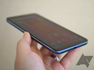
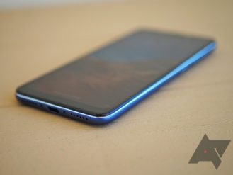
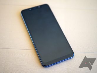
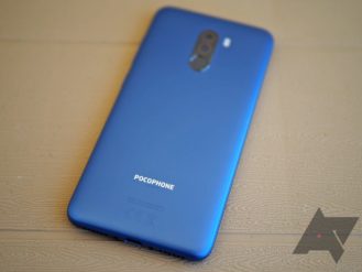
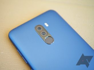
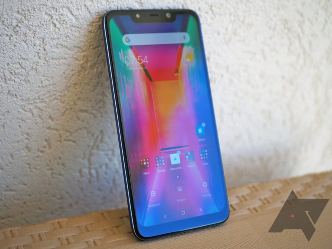
If there’s one area where the Poco F1 “skimps” on, it’s hardware materials. Most flagships nowadays use either glass or metal, but the F1 goes for plastic all around. I don’t mind that; it’s less slippery than glass and warmer to the touch than metal. Plus, the matte finish feels nice, the silver painted rim gives a believable illusion of metal, and the dark blue/indigo color I have is unique without being too flashy. For $300, it isn’t too shabby.
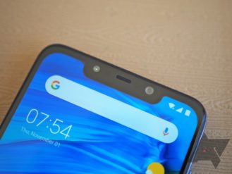
The front houses a tall 18.7:9 display beneath Gorilla Glass. It looks expensive with the screen off, but turn it on and you’ll notice a wide notch and all the rounded corners and bezels. The device, display, and notch don’t have the same corner radius, and the display’s curves are too extreme for my liking. Additionally, the bezel on the sides is smaller than on the top, which is significantly smaller than the bottom chin. All of this asymmetry sort of disappears while you’re using the phone, but stop and stare for a second and you’ll easily notice how uneven the F1 is. I think the notch is completely unnecessary and comes at the detriment of the experience — but we’ll get to that later.
The notch houses the speakerphone, which acts as a secondary loudspeaker when listening to audio, as well as the front camera and sensors (including a large IR sensor for face unlock). The notification light is moved to below the display; it took me a few days to get used to this position.
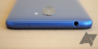
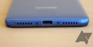
On the top, there’s a 3.5mm headphone port and microphone hole, while the bottom has a USB-C port in the middle, flanked by two screws and two grilles. Only the left acts as a loudspeaker — the right is just for show.
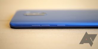
On the right side, there are metallic buttons for volume control and power, which are satisfyingly clicky. The left side has the dual-SIM tray, where one slot can be used for a MicroSD.
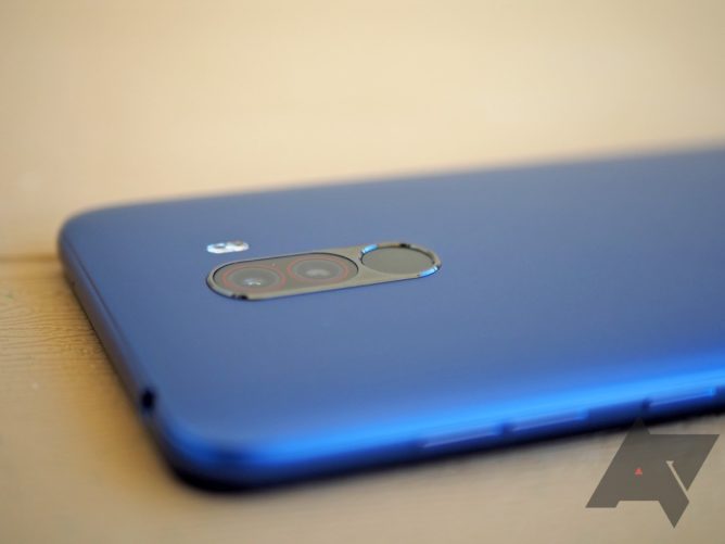
The back has a shiny Pocophone logo plus a vertical module for the two cameras and fingerprint sensor (with the dual-LED flash). I don’t like the sensor being this close to the camera’s glass, but in my use, I found little evidence of my finger’s grease or prints on the camera.
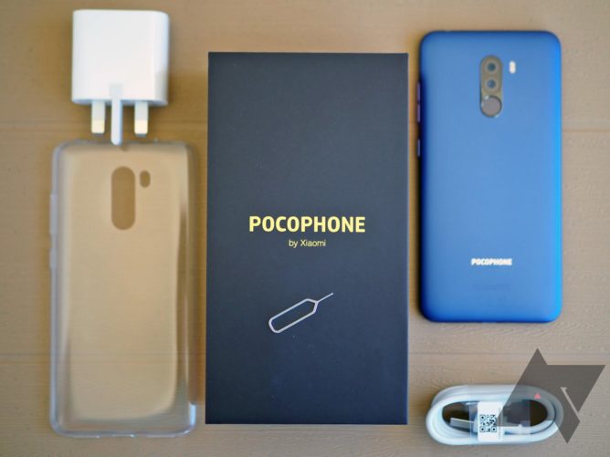
In the box, you’ll find the phone, a USB-A charger (goes up to 12V/1.5A), a USB-A to C cable, and a TPU case. The F1’s plastic build is more prone to scratches than other phones, so I recommend you use the latter.
Camera
The Poco F1’s camera is good but nothing to brag about. When there’s enough light around, it takes fast HDR pictures with decent color balance. In low light, results do get a little noisy, but that’s to be expected.
However, the secondary camera on the back is superfluous. As a 5MP depth sensor, it should technically help with portrait photos, but the result is often too extreme. The depth effect often seemed to take a focal point and just add radial blur around it, like any tilt-shift filter would. Instead, a telephoto or wide-angle lens would have added at least a different perspective for the photo.
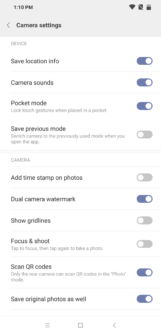
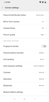
The Camera app’s UI is similar to the Mi A2‘s so I won’t go over it again; the Dual Camera watermark is also enabled by default, same as the beautification effect for the front camera. By the time I remembered to disable both, I had already taken several pics. And speaking of the front camera, it’s very good and you won’t complain about selfies taken with it (last image in the carousel above).
Software, performance, battery
The F1 is fast and responsive. Unlocking it is instantaneous, whether you’re using the fingerprint sensor or the impressive face unlock. The phone flies through every interaction I make, responding to my touch immediately, with snappy scrolling and swiping, and even snappier opening and closing of apps. In day-to-day use, I noticed no difference from my Pixel 2 XL, which is a huge compliment to give; but side-by-side testing revealed that the Poco F1 is even a little faster. The only discrepancy I noticed was when I tried scrolling down super quickly in Chrome: the page would go blank and then load the bottom. I’ll file this as a bug, or at least a small issue you won’t come across frequently.
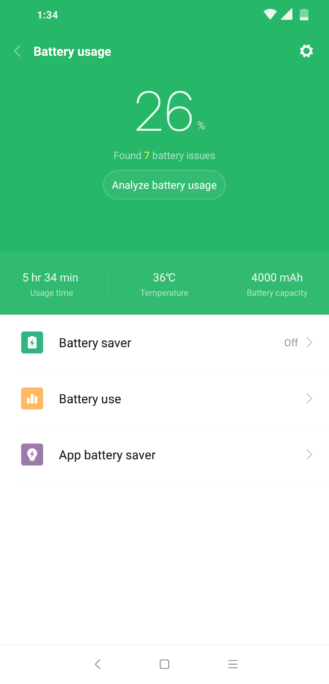
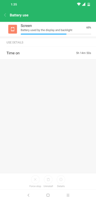
The 4000 mAh battery lasts forever too. Even with my heavy use and battery-eating crappy reception, I came home every night with nearly 40% left despite the 3-4 hours of screen time under the F1’s belt. So far, that’s unequaled in my experience. I wasn’t able to kill the F1 in a single day, and I’m sure with normal use, it could easily last two days. It’s been a while since I haven’t suffered from charging anxiety, and now I can’t imagine going back to other phones who need a top-off mid-afternoon in order to last the entire day.
Reception has been a mixed bag. I get nearly the same result on 4G or WiFi as my Pixel 2XL, which means that signal strength is inexistent indoor in my pharmacy and WiFi doesn’t reach the stock room. I’ve had other smartphones with better reception over the past year, but this is more anecdotal evidence than a scientific comparison.
Screenshots taken on MIUI 9.6, before I updated to MIUI 10 stable.
From a software standpoint, I spent my two weeks with the Poco F1 running Android 8.1 with MIUI 9.6 on top. Poco has promised to update it at least to P and Q, and has already started to roll out MIUI 10 stable (still based on Oreo 8.1). The OTA didn’t reach my unit in time, but I flashed it yesterday to check it out, then went up again to MIUI 10.8.10.25 beta.
The MIUI experience is so-so, with several benefits and some letdowns, and I already delved deep into it so you should read that if you want all the details. I won’t repeat myself beside saying that MIUI 10 fixes some of the issues of 9.6, and I do like some of it, but the constant nags, permission requests, and ads left a sour taste in my mouth.
I can’t watch videos taken with the cam on the built-in player without giving it access to phone calls.
Though the only undoing of the Poco F1, for me, was the notch and what Xiaomi did with the notification icons because of it: up to the latest MIUI 10 stable, you see none. In the latest beta, there’s a new toggle to show notification icons, but even then they only appear for a split second then disappear. If your eyes are focused somewhere else on the display, you will miss them. They will also show up when you unlock the phone, but again, just for a brief second.
Left: No icon but 3 notifications. Right: Notification icons — blink and you’ll miss them.
This is my first time using a phone with a notch, and it has cemented my opinion that it’s a silly compromise that shouldn’t have existed in the first place. I could overlook a notch if it added some vertical space without removing many icons from the status bar, but this? No, it doesn’t get a pass. A tall 18:9 display would have been more than enough.
Should you buy it?
Yes. When the Poco F1 was announced with a Snapdragon 845 and 6GB of RAM for $300, flashbacks of the first OnePlus were unavoidable. A lot was riding on this first device from Xiaomi’s sub-brand and, as far as I’m concerned, the experiment is a resounding success.
When it comes to battery and speed, the Poco F1 is a beast that rivals smartphones double or triple the price. In every other aspect, it’s at least very good. The camera, display, build, USB-C charging, 3.5mm jack, stereo(ish) loudspeakers, all contribute to a solid experience. The software will find its lovers just like it will have its haters, but it’s being continuously updated for the better, and there’s an active modding community providing alternative solutions if you’d rather go that route.
The F1 has no NFC and its LTE bands are limited though, so it won’t appeal to those who absolutely require these two features, but that’s Xiaomi’s stance for now. It’s leaving part of the market on the table for others to exploit, though I doubt this will go on for long.
Buy it if
- You want the absolute best Android hardware available under $500
- You like Xiaomi and the MIUI experience, or you’re willing to flash an alternative ROM
- You don’t care about NFC and your carrier LTE bands are supported
Don’t buy it if
- MIUI is not your cup of tea and you don’t want to bother with custom ROMs
- Notifications are very important to you
- You have $200-$300 and just want a good Android device — the Mi A2 runs stock Android and is cheaper, but slightly less capable.
http://platform.twitter.com/widgets.js


