I reviewed the Galaxy S10+, and I had a lot of positive things to say about it. Epic battery life, an outstanding display, and performance that blew away almost anything coming out of 2018 set a new bar for smartphones this year, and I still think all that’s true. But it’s a phone with drawbacks: a fairly terrible fingerprint scanner, a very high price, and a bunch of secondary cameras that really aren’t all that great, making them feel like afterthoughts. The standard Galaxy S10 doesn’t really do much to redeem those faults – it’s a bit cheaper, sure, but you take such a substantial hit on battery life that it’s hard to say it comes with no tradeoffs.
The Galaxy S10e has emerged as the “other option” as far as most critical analysis this year is concerned as a result. Why? The $750 price point. The much better side-mounted fingerprint scanner. The lack of several lackluster and largely unnecessary cameras. And performance that should be indistinguishable from its bigger, more expensive siblings. As such, the S10e is the obvious ‘looks good on paper’ option for someone wanting to save some money on their Galaxy smartphone purchase this year, and the questions you might have probably come down to whether there are any unexpected land mines to this phone – things that may not be immediately obvious until you use it.
I’ve spent the last week or so doing just that, and my verdict is that what you see on paper is largely what you get in practice. The S10e’s one real “but” is the battery life, which isn’t bad, just very average. That makes it pretty easy to recommend: you’re getting 90% of the Galaxy S10+ experience for 75% of the price. And some people may find the diminutive size an advantage versus the admittedly gargantuan S10+.
This review is sponsored by TopGreener, manufacturer of awesome power outlets featuring a built in USB Type A QC 3.0 and USB Type C Power delivery ports. Check out the conclusion to learn more about TopGreener’s great products.
Design, hardware, what’s in the box
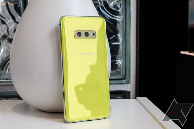
While the aesthetic of the Galaxy S10e largely mimics that of the larger S10 and S10+, there are some key differences. For one, the screen isn’t curved. This actually ends up being a benefit in every sense but a visual one (the curved screens do look cool), because the S10e has none of the annoying edge rejection issues that the curved phones do (especially outside of a case). The smaller size also means that reaching the volume rocker and power key, and even the notification bar, are nowhere near the kind of stretch they are on the S10+. The S10e is easily the most ergonomically pleasing of all the Galaxy S10 models, something which may matter a lot when you’re deciding which phone to recommend to friends or family (and the S10e is now my go-to).
Otherwise, the S10e is basically a carbon copy of its siblings. A headphone jack, USB-C port, and bottom-firing speaker sit along the bottom of the phone, and there’s a punch-hole cutout for the camera in the screen. Speaking of the display, while it is a 1080p panel, nobody is going to notice a difference. The S10e is bright, sharp, and vivid, and to my eye is basically identical in terms of color reproduction and brightness to the S10+. This phone hasn’t been given an inferior display to offset the cost difference, if that’s a worry you had.
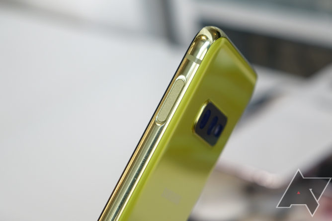
The fingerprint scanner is mounted on the power key, and it’s leagues better than the S10 and S10+’s in-display system.
As to the question of the fingerprint scanner, it’s pretty damn good – so long as you’re using your phone with your right hand (unlocking with your left is a bit of a stretch). The scanner does not require you to depress the physical power key to read, and it responds quickly and reliably, though I must admit it did take me a few days to get used to it coming from the S10+’s in-display scanner, which still has me trying to turn on the S10e by fruitlessly thumbing at the bottom of the screen. Anyway, this is much better than that terrible solution, and earns the S10e major bonus points.
The two little things that became apparent to me in terms of unstated features the S10e was shortchanged on: haptic feedback and the speaker. Haptics simply are not as good as the S10+, which is finally approaching Pixel levels of goodness in terms of providing a solid, less buzzy experience that is on some level at least a vague impersonation of Apple’s excellent Taptic Engine. The S10e gets pretty standard Samsung haptics, and they’re fine, but nothing remarkable. As to the speaker, it’s very noticeably quieter than my S10+’s, and just doesn’t sound quite as good generally. The S10+’s has better dynamic range, the S10e’s sounds a little muffled. It’s not bad, it’s just not going to compare well to big, flagship phones.
In the box, you get Samsung’s same excellent AKG earbuds and the same quick charger and USB-A to C cable you do with the other Galaxy phones this year. The headphones are great, and sound noticeably better than OnePlus’ Bullets C or Google’s USB-C Pixel earbuds.
Cameras
For info on the cameras and sample shots, check out our Galaxy S10+ review. Minus the telephoto images (the S10e has no telephoto lens), results, performance, and capabilities are going to be identical between all of Samsung’s S10 models.
Software, performance, and battery
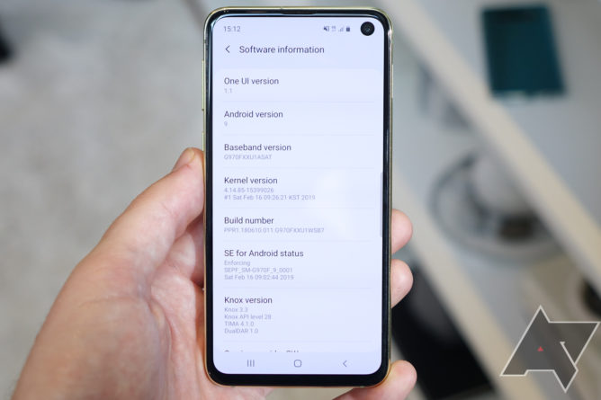
For our longer take on OneUI, I once again direct you to the Galaxy S10+ review we published last week. The S10e has exactly the same software with all of the same features. The short take is that I genuinely think Samsung has done a good job with OneUI, and this is the most polished and mature its software has ever been. OneUI’s night mode, excellent overall performance, and simple launcher make it a pleasure to use right out of the box. And given all the tweaks Samsung allows (plus simple givens like changing the keyboard and browser to Google’s apps), I’d have a hard time taking anyone who claims to “hate” Samsung’s software seriously these days. Sure, the general look of it isn’t for everybody, but there are precious few areas where Samsung actually screws up Android meaningfully. Some, like the lockscreen, can be fixed. Others, like Bixby, can effectively be turned off.
Performance has been comparable to what I experienced on my Galaxy S10+, which is to say exceptional. The S10e flies through apps and is almost impossible to appreciably slow down. The Snapdragon 855 really does seem to deliver, and with 6GB of RAM, there’s plenty of memory to avoid nasty background app backstabbing.
Battery life is probably about what you’d expect given the numbers. It’s a 3100mAh battery – about 75% of the capacity of the S10+’s – with a display around 80% the size. Given it’s going to have the same power consumption characteristics otherwise (processor, modem, sensors, software), that inevitably means this phone is going to have worse battery life. I think five hours of screen time in a day with the S10e will be totally doable for most people as long as you’re spending a lot of that time on Wi-Fi and at moderate to low screen brightness. On LTE only or with the brightness cranked, you’re probably going to see substantially less. Still, that’s way better than what I experienced with my Pixel 3, which was lucky to crack four hours of screen time even under the best of circumstances.
Should you buy it?
Yes. The Galaxy S10e is probably the best Android phone for most people right now, and may well hold that title for the whole of 2019 at this rate. Given discounts are eventually likely, I’d say this phone will become a no-brainer the moment it drops to $650 or lower – I just can’t see anyone matching the price to experience ratio on this phone, unless a big screen and huge battery are very important to you. Even at $750, I still think it’s priced very fairly for what you’re getting: an industry-leading display, excellent rear-facing camera, cutting-edge performance, and all the features you’d expect of a proper “flagship” Samsung smartphone (fast wireless charging, IP68 ruggedization, microSD, headphone jack, all the LTE features, etc). As a phone to buy or recommend to others, it’s an absurdly easy choice.
Do you hate the look of cell phone chargers sticking out of outlets throughout your home? They are bulky, unsightly, and easy to misplace. TopGreener offers a far more elegant solution with their line of power outlets with built in USB ports for effortless charging without the messy look of protruding power adapters.Perhaps the most versatile outlet in their lineup is the one pictured below. It features one standard wall socket, and two USB ports. The one of the left is a USB-A port that supports QC 3.0, and the one on the right is a USB-C port with power delivery (5V/3A, 9V/2A, 12V/1.5A). This is the perfect solution for households with devices that charge faster with one charging standard than the other.
With TopGreener’s Intellichip technology, your devices will charge at their optimal rate and won’t overheat or overcharge. The face plates on the outlets are also interchangeable, so if you scratch or mar one you can replace the plate without needing to swap out the whole outlet. The TopGreener outlet is available on Amazon for the reasonable price of 39.99, but Android Police readers can save $6 by using the code ANDRPO15 at checkout.


