After a period of what seemed like smartphone stagnation, we’re finally seeing some weird devices again. With edge-to-edge screens, hole-punch cameras, and displays that fold in half being high-end oddities, Sony saw fit to shake up the budget formula, too, and plopped ultra-tall 21:9 displays in its Xperia 10 and 10 Plus. And while I applaud its efforts, being long doesn’t save the Xperia 10 line from being terminally boring.
Design and hardware
Credit where it’s due: Sony tried something different with the Xperia 10 line. Its design language is unremarkable (and maybe a little ugly), but these phones are long. The 10 has a 6-inch display, while the 10 Plus sports a 6.5-inch screen — both 1080p LCD panels with a 21:9 aspect ratio. For reference, the smaller of the two is almost identical to a dollar bill in size and proportion. The value of such a uniquely skinny form factor is dubious, but Sony has to be awarded some points for originality.
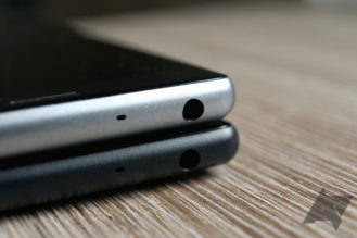
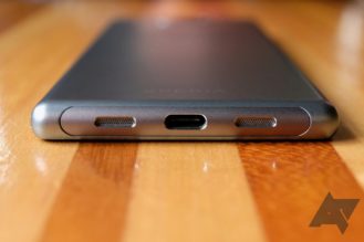
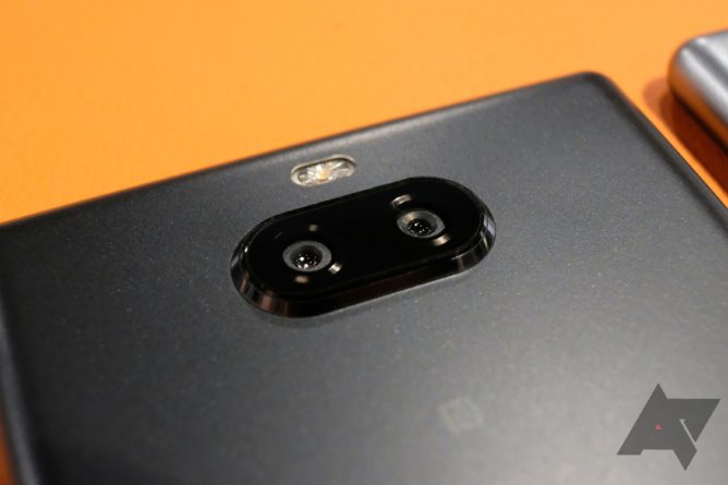
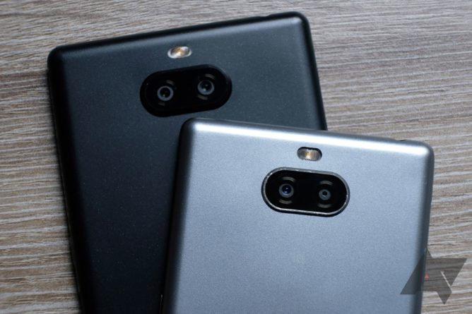
Aside from their screens, both phones are bog-standard low-cost Android devices: plastic bodies; tinny, bottom-firing speakers; and unimpressive dual cameras. Each phone also has a headphone jack and a microSD card slot, though — increasingly rare features that a lot of users value.
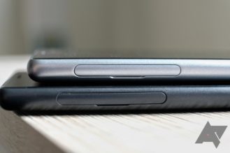
Left: The SIM tray and microSD card slot can be accessed without an ejector tool.
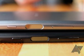
On the right edge of each phone live power and volume keys, as well as a mirrored fingerprint scanner. That scanner is very sensitive and accurate, but its placement meant that I’d often accidentally brush it with my thumb after tapping the power key to lock the device — accidentally unlocking it again in the process. I did this consistently over a couple of weeks with the phones, and I wonder if I’d ever get used to it. You can’t swipe down on the scanner to bring down the notification shade, which, with such long displays, is a bummer.
On the smaller Xperia 10, the volume rocker is awkwardly placed, and I had to shimmy the device in my hand to turn the volume down. The power button is in just the right spot, but the discrete fingerprint scanner between the two controls makes for unwieldy spacing; I wish the scanner was embedded in the power button like it is on some other devices (take Samsung’s Galaxy S10e, for example).
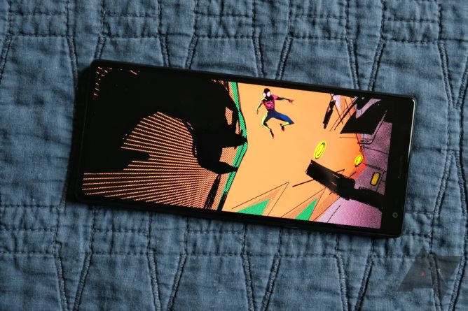
21:9 content does look striking on the Xperia 10 and 10 Plus.
Of course, the headliner here is the display. It’s a 1080p LCD panel in both phones, and it’s very nice — pleasingly bright and vibrant, particularly when set to super-vivid mode. You can also tweak the color balance to your liking with a handful of presets or manual RGB sliders.
The argument for such a long display is that in portrait orientation, you get more content with less scrolling, plus better multitasking. In landscape, cinematic content (like the trailer for Sony-produced Spider-Man: Into the Spider-Verse that comes pre-loaded on both phones) can be displayed without black bars.
Personally, I don’t do split-screen multitasking often enough for an improved version of it to be a selling point, and I can’t remember the last time I watched a full movie on my phone. So while it’s a pretty good screen, nothing I like about it has to do with its height.
Software, performance, and battery
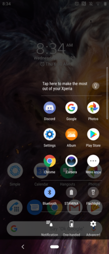
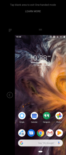
Sony’s take on Android is very similar to Google’s, with only a handful of unobtrusive customizations. There’s a one-handed mode that can be accessed by double-tapping the home button; it shrinks the screen into either the bottom right or bottom left corner of the phone, depending on your preference, making it easier to reach high-up content. There’s also side sense, which is a transparent bar on the edge of the screen that can be double-tapped to access a list of frequently-used apps. Flicking it up or down also goes back, which, particularly on the 10 Plus, is often more convenient than craning your thumb to the navigation bar.
There are a few pre-installed apps outside of the normal Android suite, including Sony’s email client, photo album, and contacts app — plus Facebook and Netflix. Aside from their remarkably ugly icons, Sony’s system apps are fine, but they’re not as good as Gmail, Google Photos, or Google Contacts. There’s also an Xperia Lounge app included, which seems to primarily contain ads for Sony products alongside random gaming and entertainment news. You can’t easily uninstall any of this cruft, but it’s simple enough to disable.
The Xperia 10 runs on a Snapdragon 630 with three gigs of RAM; the pricier Xperia 10 Plus moves up to a Snapdragon 636 with four gigs of RAM. Either has ample horsepower to manage basic tasks like streaming video, browsing social media, or playing Wordscapes — and even more intensive games like PUBG run just fine (on low settings, anyway). Content takes a little longer to load than I’d like, and flicking back and forth through recent apps can occasionally be an exercise in frustration, but overall, it’s about what you’d expect.
Battery life isn’t especially great, though. The Xperia 10 and 10 Plus are powered by 2,870 and 3,000 mAh cells, respectively. Those are by no means beefy relative to the phones’ huge screens, and that’s reflected in longevity: a typical day with either phone saw me getting about five hours of screen time before I had to hit a charger.
Cameras
The Xperia 10 features a 13-megapixel camera paired with a five-megapixel secondary sensor that’s only used for depth sensing (for bokeh, of course), while the 10 Plus has a 12-megapixel primary shooter plus an eight-megapixel telephoto. In ideal conditions, you might get some okay shots, but in my experience, photos from either phone are generally soft and washed out, with poor dynamic range that tends to blow out highlights.
Both phones have scene detection that seemed to get what I was looking at right a lot of the time, but never managed to improve the end result. The artificial bokeh effect created by the dual cameras is surprisingly convincing, but it’s not enough to save an otherwise lackluster setup.
Should you buy them?
Probably not. There’s no one bright red flag to point to in the Xperia 10 and 10 Plus as an obvious reason to stay away, but at $350 to $430, you’re looking at devices that cost as much as gently used models of last year’s flagships. There are also other budget phones — like the Nokia 6.1 and 7.1 — that offer similar specs for less money, without the goofy tall screen. Heck, if you can save up a spell longer, the OnePlus 6T is just $120 more than the Xperia 10 Plus and absolutely blows it out of the water in every conceivable way.
Buy if:
You really love multitasking or watching 21:9 movies on the go.
Don’t buy if:
You don’t need that tall screen (and you probably don’t). There are similar options for less, better used phones for about the same price, or wildly better new picks for a bit more.


