Over the last six months or so, Honor has undertaken a rebranding exercise in part to give the impression of a more modern smartphone maker that appeals to a youthful audience and in part to distance itself from parent company Huawei. In view of recent political developments, it’s obviously hugely beneficial for Huawei to have a sub-brand that carries a different name and cachet, although they come as a package as far as Google is concerned and that looks like it could spell trouble for both.
Let’s assume, for a moment, that it will all get sorted out (otherwise this review will have been a massive waste of time). Honor hopes its latest flagship phone will capture the imagination of the youth market as part of its refreshed image. The Honor 20 Pro could readily be described as a budget Huawei P30 Pro, bringing photography excellence and versatility to a younger, less affluent audience. Despite its low price, the phone still features Huawei’s top-of-the-line Kirin 980 SoC as part of a spec sheet that is anything but budget. On paper, the camera setup even comes close to Huawei’s pricey flagship, which poses a similar question to the one the Pixel 3a had many reviewers asking — do you need to fork out the extra cash when this cheaper version does most of the same things just as well?
Design, hardware, what’s in the box
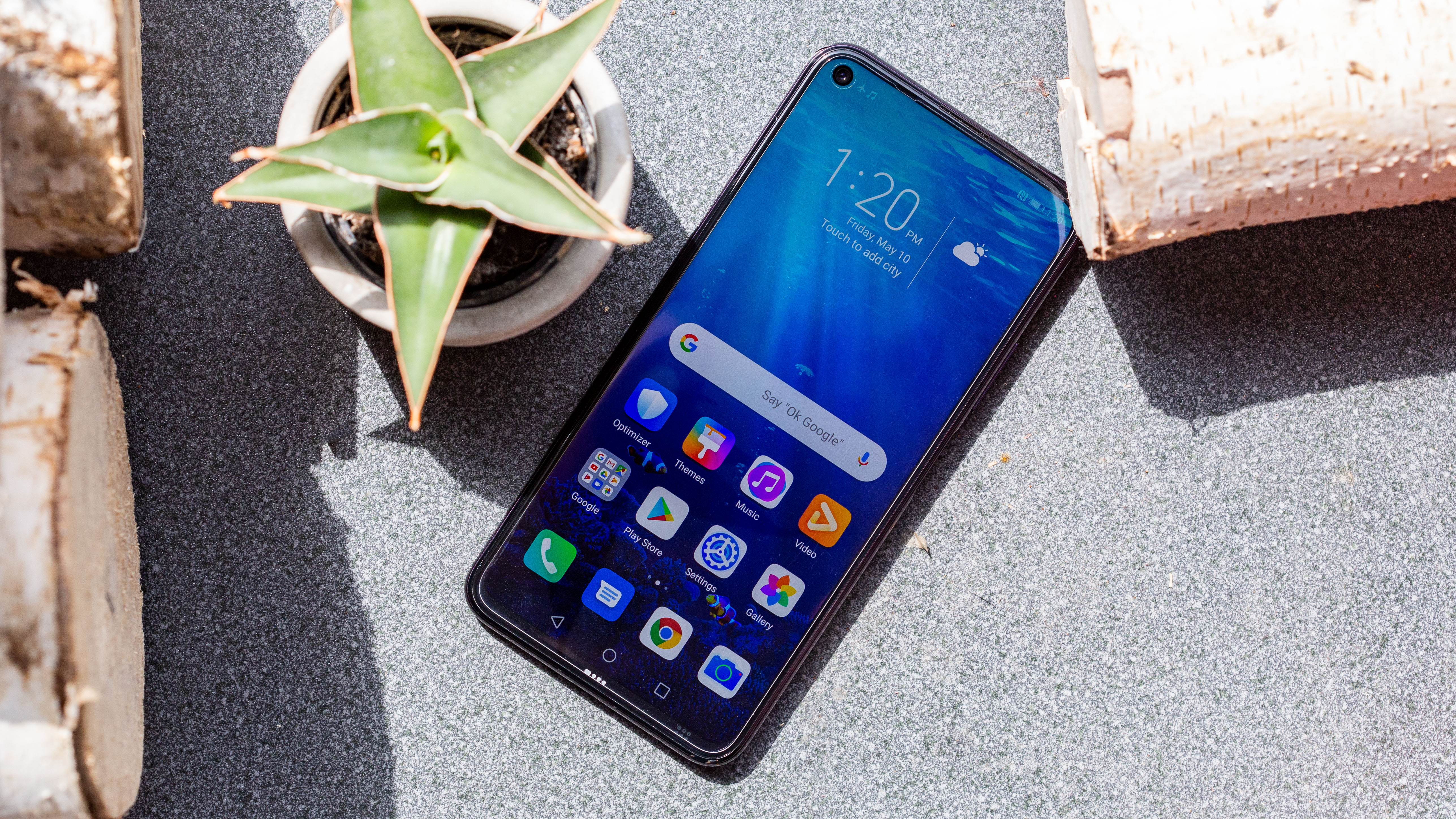
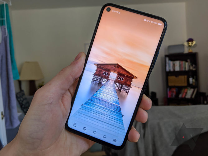
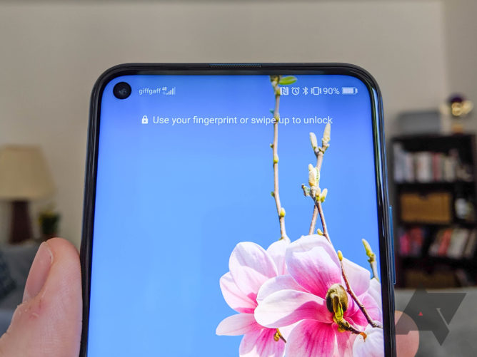
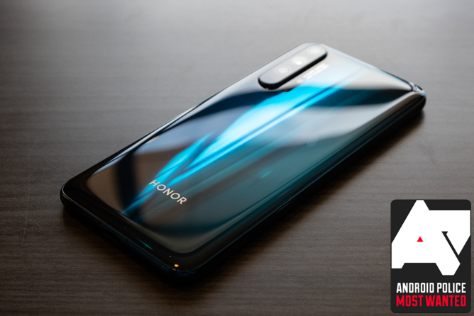
Honor seems to have settled into a consistent and attractive design language, evidenced here by the decision to go with the punch-hole display once again. The 4.5mm hole that houses the front camera is on the left side, unlike Samsung’s S10 phones, with the time in its traditional position on the right and it really doesn’t take up too much of the status bar (around two notification icons). The chin bezel is slightly larger than the others around the phone, but you’re ultimately looking at a device that is almost all screen and it’s hard to fault it.
The 6.26-inch FHD LED display makes for a modestly sized phone that fits comfortably in the hand, roughly a centimeter shorter than the Pixel 3 XL I’ve mostly been using recently but with an equivalent usable screen size. The display itself is not of the highest quality — it’s a little shadowy around the edges — but it will be adequate for any but the most discerning of users and gets plenty bright enough. While the screen portion is completely flat, there is a subtle curve on the edges to make side swipes feel really satisfying. The default display calibration tends towards a colder profile with vivid colors but this can be altered to your liking in the settings. I did find the automatic brightness setting to be a little over-aggressive with its adjustments to begin with, but this seems to have improved over time (and after an update or two) so that shouldn’t be a great concern.
Although not much greater in dimension or weight, the Honor 20 Pro feels bulkier than the company’s last flagship, the View20. It is a few millimeters thicker and the camera bump is one of the most conspicuous around, explaining why it feels substantial in the hand. Something also feels a little off about the weight distribution. I didn’t use a case, but it would be prudent in order to protect the rear glass, and that would further add to the phone’s heft. After seeing what Google has done with the Pixel 3a, I find myself questioning the use of anything other than plastic for the casing of an affordable phone. It probably does make this phone feel more premium than it is, though, which is presumably the intention. The buildup of smudges and smears somewhat ruins the aesthetic after a day or two, however. This phone is also one slippery little bugger, to the point where I had to anchor my charger to prevent it sliding off my bedside table during the night.
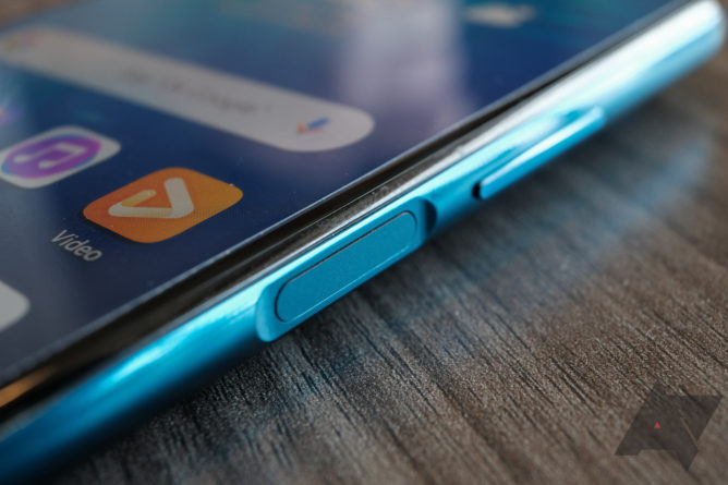
Thankfully, Honor resisted the temptation to include an in-display fingerprint scanner, although it has moved to a side-mounted scanner that’s part of the power button. Like most capacitive scanners these days, it’s accurate and fast to unlock, but its location still irks me. As I’m sure some of you do, I like to occasionally glance at my lock screen notifications without unlocking and entering my phone. This is only possible on the Honor 20 Pro if you wake it with a finger for which you haven’t registered a print or by not fully presenting your thumb as you would to unlock. The muscle memory I’ve built up from using other Android phones tells me this isn’t right, and there’s sadly no setting for correcting it.
In terms of other hardware features, there’s a notification LED hidden inside the earpiece strip atop the display, and there’s a single bottom firing speaker grill to the right of the USB-C port. The sound produced by this speaker is loud but muddy, and it’s all too easily muffled when holding the phone in portrait. Haptics are another area in which the Honor 20 Pro does not excel — the vibration motor is very loud and rattly, so I disabled it for typing purposes. In case you were wondering, there’s no mention of waterproofing at all so bear that in mind. I got caught in the rain a couple of times and had to be more cautious than usual.
In the box, you’ll get a 22.5W SuperCharge power brick, USB-A to USB-C cable, 3.5mm to USB-C headphone adapter, and a TPU case (although my review unit was without that last piece).
Performance, software, battery life
Huawei was arguably first to the 7nm punch with the Kirin 980 SoC with Dual-NPU, and it continues to perform at least as well as the best silicone from Qualcomm, Apple, and Samsung. That even Honor can include that chip in this price bracket is impressive, making for stellar performance when coupled with 8GB of RAM and 256GB of storage. Multi-tasking is a cinch while animations, scrolling, and the general experience are all very smooth. I’m not particularly into mobile gaming, but the few games I do occasionally play (such as Alto’s Odyssey) were handled with ease.
Whenever a reviewer criticizes EMUI, or the rebadged Magic UI that ships on Honor phones, they’re met with a stream of disapproval in the comments, but that doesn’t mean we should give it an easy ride. It’s certainly true to say that the software has improved, but it’s still littered with annoyances that you would only notice when switching between phones often and using other Android skins. Notifications are something stock Android does so well, and so much better than iOS, yet Huawei insists on messing with them. Only the most recent alerts grace the lockscreen, and even then they can’t be expanded or interacted with. Other Android phones allow you access to the full notification shade, but here there’s no option for it.
Another major bugbear for me is the status bar. I don’t need to know that NFC is turned on; it’s always turned on. And why are the mobile and WiFi icons on the left where notifications should be? These are annoyances that could so easily be resolved with simple settings — see OnePlus for how this should be done. You get the option to turn the ‘carrier name’ off, so why not allow customization of the other status bar elements? The thing I most miss from the Pixel 3 XL I’ve been using for much of the last 6 months is probably the always-on display, but since this phone has an LCD panel, that omission is understandable.
Too much visual clutter makes it difficult to see what’s important.
There are aspects of the software I do like, however. The gesture navigation is essentially what Google has aped for its latest implementation, and after getting used to it on the Pixel with Android Q Beta 3, I was happy to be met with a mostly identical experience here. The one place it falls down is that there’s no quick-switching gesture, but the back button works just as well in my opinion and is now my preferred method. Another useful enhancement in Magic UI is a native screen recorder, accessible by pressing volume up and power (similar to the screenshot shortcut). Many third-party Android skins include this and rightly so. I feel like the touch response and scrolling are much improved compared with previous Honor phones, so that’s another plus point.
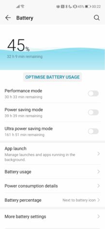
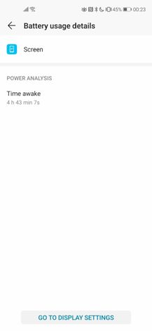
Battery life on the Honor View20 was monstrous, and the Honor 20 Pro continues in the same fashion. The capacity of 4,000mAh is more than enough to last through a full day, and some people will get two out of it. I tended to end the day on around 45-50% with a screen-on time ranging between 3-5 hours, which is frankly dreamy compared with the lackluster longevity offered by my Pixel. The included 22.5W fast charger can get you to almost 50% after just 30 minutes, so it’s easy to top up before heading out for the evening. Wireless charging is one feature that isn’t included, understandably at this price.
Camera
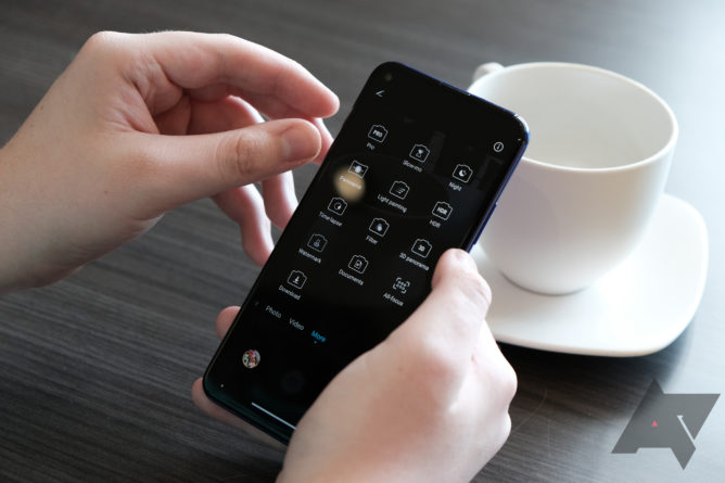
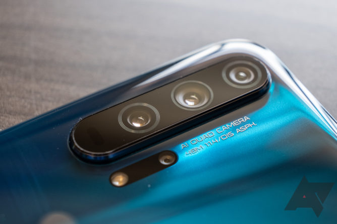
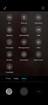
According to Honor, its research suggests that camera capability is the biggest priority for its youthful target audience, making the decision to max out the camera tech on the Honor 20 Pro an easy one. It’s not just reminiscent of the Huawei P30 Pro in looks — the imaging setup is also very similar. This phone includes a 48MP main camera (Sony IMX586) with a large 1/2 -inch sensor size, although by default it outputs pixel-binned 12MP shots. OIS, AIS, and EIS are joined by PDAF and laser autofocus for an incredibly feature-rich main shooter. To complement it, there’s a 16MP super wide angle (117°) and 8MP telephoto that allows for 3x lossless optical zoom, 5x hybrid, and up to 30x digital zoom. Instead of a TOF sensor like the P30 Pro, the Honor 20 Pro has the fun alternative of a 2MP macro lens with a recommended distance of 4cm. On the front, inside the punch hole, is a 32MP selfie cam.
Now that all sounds very impressive, but it’s the performance that counts. Thankfully, it doesn’t disappoint. The results from the main sensor are much the same as with the View20 — you get insane amounts of detail and well-balanced contrast. I don’t think you quite get the dynamic range of a Pixel, but the color reproduction is on point and photos are generally very true to life. The 3x zoom on the telephoto is excellent, while you don’t lose too much detail using the 5x hybrid zoom either. The wide angle lens is also a welcome inclusion, adding huge value to landscape shots. While the macro lens allows you to focus much closer (4cm) than you would ordinarily be able to, at just 2MP, the resulting photos aren’t especially impressive. A TOF sensor might have been a more useful inclusion.
Left: Pixel 3 standard mode, Night Sight. Right: Honor 20 Pro standard mode, AIS Super Night Mode.
AI imaging features are all the rage these days, and the Honor 20 Pro is no exception. AI Super Clarity mode utilizes the full 48MP resolution and combines several shots for extra accuracy. Zooming in on the resulting image will show off stunning detail. The AIS Super Night Mode works in a similar fashion to brighten low-light scenes, and it’s almost as impressive as on the P30 Pro. It was said of that phone that even in the standard mode the sensor pulled in a ridiculous amount of light, and the same is true here. Super Night Mode then adds extra detail for some remarkable shots — see the examples above.
Should you buy it?
Yes (*but also maybe not right now). It’s not a perfect device by any means, and for a lot less you could get yourself a Pixel 3a, but I do see this phone appealing to younger smartphone users who want something a bit more modern and enjoy messing around with camera features. Who knows, maybe even the number of cameras on the back of your phone is a source of pride among the youths of today. Regardless, few phones can match the versatility offered by the camera setup on the Honor 20 Pro. As a point and shoot purely for the occasional Instagram post, it won’t let you down, but it can also do so much more if you’re down to experiment. Add great performance and incredible battery life into the mix and this phone is easy to recommend, even if I still don’t get on with Honor’s inferior software experience.
*It would be remiss of me not to mention the current state of affairs that see Huawei/Honor likely to lose access to Android updates and the Play Store. There’s much political posturing at the moment, and everything is a little up in the air, but I would say it’s best not to buy this phone right now. Wait until the current situation is clearer.
Buy if:
- You’re a no-good yout.
- You want great camera performance and a nice-looking phone for a reasonable price.
Don’t buy if:
- You want a better software experience, a headphone jack, or a really nice screen.
- Camera versatility isn’t that important to you.


