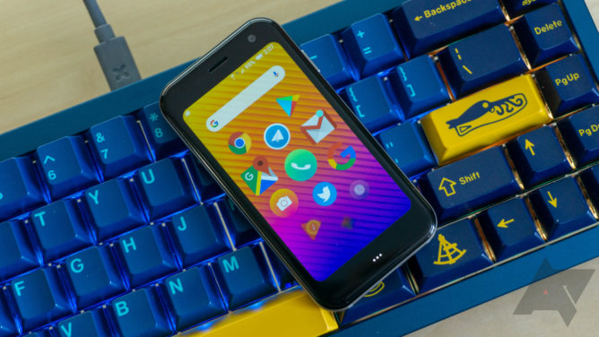
Unlike most phones we review, the Palm Phone does not claim to be the equal of another device. It doesn’t even necessarily claim to be good. The Verizon-exclusive Palm Phone is billed as a companion to the phone you actually like using. A phone that’s minimalist and limited by design can’t be “good” in the traditional sense, but can it be bad in a way that you still might want one? Sadly, no.
The TCL-made Palm Phone is fascinating because of how odd it is. So many phones these days are predictable and boring, but this one is at least interesting. It’s not interesting enough to buy at $350, though, and certainly not when you can only get it as a secondary device on your already spendy Verizon line.
Design, hardware, what’s in the box
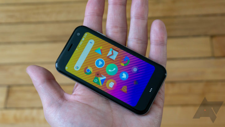
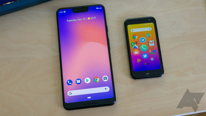
The Palm Phone is an almost impossibly small phone. It’s like a relic from that time before modern smartphones when everyone wanted to make devices as small as possible. If a phone was tiny, it was probably pretty expensive. The Palm Phone is, too. I’ll grant that, as an object, it feels relatively high-quality with its aluminum and glass chassis. The front and back glass panels are rounded at the edges, flowing smoothly into the aluminum frame. It looks a bit like a stretched-out Apple Watch, and it is IP68 rated.
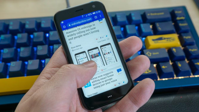
The Palm Phone has a 3.3-inch LCD at 1280×720. This is a diminutive display by today’s standards, but 3.2-inches was a common size for the first wave of Android phones a decade ago. We’ve come a long way since then, and the Palm is a reminder that progress is good. You can use the Palm Phone, but everything is cramped, and good luck entering text. On the plus side, the 720p resolution at this size looks nice and crisp. Countering that, there’s noticeable backlight bleed at the edges.
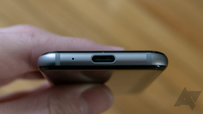
While the phone has optional on-screen navigation buttons, there’s a single button below the screen that’s always active. You can tap for back, double-tap for home, and long-press for multitasking. I would have made some changes to this setup, but the button is not customizable. This phone is practically begging for gesture navigation, but alas. The only other physical button is the power button on the right edge. It’s right above a SIM slot that’s locked in the phone—you can’t eject it. More on that later. On the bottom edge, we have the Palm Phone’s only port: a USB Type-C.
I’ll give TCL this much: the Palm Phone is adorable. Everyone I’ve shown this phone to gets a real kick out of it. That’s not to say they’d want to use it, but people are strangely happy to hold this tiny phone. It’s like a little novelty liquor bottle that makes you feel like a giant, except you’re paying Verizon for the privilege of using it every month.
The Palm Phone should activate automatically the first time you start it up, and it shares a number with your “main” Verizon phone (and adds $10 to your bill). As mentioned above, the SIM slot is locked in place, so there’s no using this as a regular phone. It’s a companion for your big phone, and that’s all. It works simultaneously alongside the other device, but the Palm has its own LTE so you can take it out and leave the other phone at home. That’s the pitch—your regular phone is distracting, so take this little thing you won’t want to use instead. I don’t think Verizon has made a compelling argument for the Palm Phone.
The Palm Phone comes with no accessories to speak of. There’s the phone and the 5W charger. There is no headphone adapter. Verizon sells a few quirky little cases for the phone, but none are included.
Software, performance, battery
When I started up the Palm Phone, I was surprised to see that it’s just the same old Android setup experience. For some reason, I expected TCL to have stripped the OS down more, but it has most of the same features as your larger phone. They’re just frustratingly hard to use because Android has outgrown small displays.
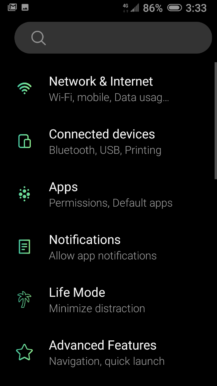
Since there’s no fingerprint sensor, you have the option of setting up face unlock or using a standard pattern/PIN, password for security. The face unlock feature uses the front-facing camera, so it’s not particularly effective or secure. Setup also asks if you want your phone to operate in “Life Mode,” which blocks all notifications when the phone is asleep. When you wake it up, only select apps can interrupt you. This is jives with the supposed use case of minimizing digital distractions. Frankly, it just makes the phone confusing to use. Android has a do not disturb mode that works just fine. The Palm Phone has DND, too. Again, that’s confusing.
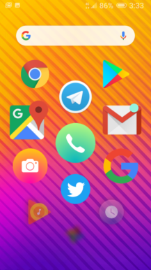
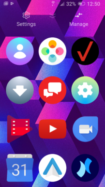
The launcher is probably the weirdest part of the software puzzle. At the top, you get a standard Google search bar. Below that is a staggered three-icon wide scrolling list of apps. This is your “favorites” list, which is like the home screen on other apps. Scroll to the bottom, and you get a separate non-staggered scrolling list of all your other apps. It’s a strange arrangement that strikes me as different just for the sake of being different. It’d be a nightmare to find anything if you had more than a few apps installed. I do like that TCL included Google Discover with a swipe to the left. On the right is an optional widget page. Palm doesn’t seem to support background images on the launcher, but you can use a third-party app to add one.
The Palm Phone has a sort of “tropical night” theme: black backgrounds with orange, pink, and green accents. I find the colors rather pleasant, actually. The theme extends to the keyboard, which is a custom version of Fleksy. For some unfathomable reason, the stock keyboard does not support gesture typing. Entering text on the Palm Phone is painful even when you swap in a better software keyboard. This is what it was like typing on phones a decade ago, and I don’t want to go back.
The 3GB of RAM and Snapdragon 435 are probably more power than this device strictly needs. TCL could have stripped down the feature set even more and slapped a bargain basement MediaTek chip in the Palm to make it cheaper. Animations are smooth, and it multitasks surprisingly well. Well, switching between apps is arduous because of the screen size, but they stay in memory well enough. However, there are some issues with overall speed. Sometimes the Palm Phone hangs when opening apps or going to the home screen. It’s not a fast phone, but it’s probably fast enough for the intended use case.
With a meager 800mAh battery, you shouldn’t expect the Palm Phone to last a long time even with the small display. I made a good faith attempt to use this phone full time, annoying though it was. I browsed the web, managed email, snapped photos, streamed music, and sent messages on this miniature phone. The Palm Phone seems to get a little over two hours of screen time, and it won’t make it a full day. It’s not really intended to, though. When you plug it in, the Palm Phone only charges at 5W, but again, an 800mAh battery is nothing. It’ll charge plenty fast.
Camera
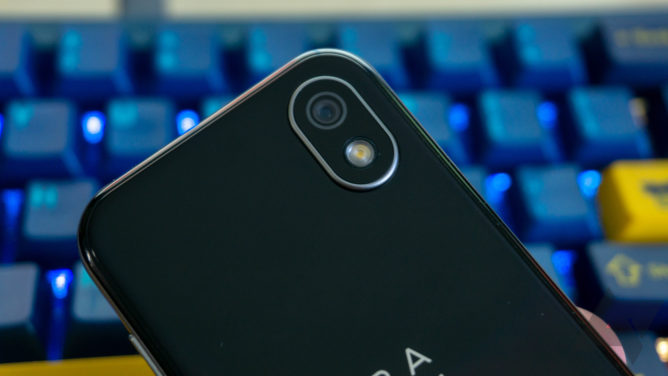
The Palm Phone has a single rear-facing 12MP camera and a front-facing 8MP sensor. I don’t have much positive to say about the camera on this phone—it seems like an afterthought and totally at odds with the Palm Phone’s intended use case. Here are some sample photos.
In bright light, the Palm Phone can occasionally take a good photo. The colors are muted, and many objects have an unusually soft quality, but you could probably get away with uploading them to social media. However, long capture times and squirrely autofocus make it tough to get a good shot. At night, just don’t bother. The Palm Phone pulls in so little light that you can barely make out some photos that would have been passable if taken on other phones. And let me remind you, the Palm costs $350. Any other budget smartphone would shoot vastly superior photos.
So, these photos are plainly bad, and the “companion phone” excuse doesn’t hold water here. If you’re going someplace where you intend to engage with your fellow humans rather than your phone, you might still want to take some photos. This is something people do at social gatherings. The Palm Phone has a terrible camera, though. If it was going to be good at just one thing, this should have been it.
Should you buy it?
No. I like that this phone exists because it’s weird, and most phones are predictable these days. That’s not enough to make it a good purchase, though. Verizon’s asking price and companion line requirement make this a non-starter.
The Palm Phone is a $350 novelty, and it’s one you’ll get bored with quickly.
As a smartphone, the Palm is a poor experience. The screen is too small to be comfortable with modern apps that expect more real estate—things get cut off, and typing is awful. TCL’s attempt to make the experience minimalist with features like the launcher and Life Mode fall flat, too. The Palm Phone is fun to play with for a few minutes, but I can’t imagine regularly taking this thing with me on a night out instead of my real phone. The awful camera alone is enough to put me off.
The Palm Phone is a $350 novelty, and it’s one you’ll get bored with quickly. You’re spending that money because the phone is tiny and adorable, not because it’s remotely worth that much. TCL should have made this a cheap unlocked phone—less storage, less RAM, and don’t even bother with a camera if it’s going to be this bad. At $99, people might bite for the novelty factor, but not at $350 with an additional monthly fee.
Buy it:
You love tiny electronics no matter how impractical.
Don’t buy it:
You want to use a good phone.


