Despite being frozen out of the US market due to political opposition, Huawei still managed to surpass Apple this summer to become the world’s second largest phone maker behind Samsung. The Chinese manufacturer was the first to market with triple rear cameras in the P20 Pro this Spring, and many lauded its photos as the best produced by any smartphone.
Huawei’s latest flagship effort is the Mate 20 Pro, with a similar camera setup and innovations such as an in-display fingerprint sensor and 3D laser depth sensing for secure face unlock. It’s powered by the proprietary Kirin 980 chipset — the world’s first 7nm mobile SoC — and sports a 6.39” 2K+ OLED display. The Android smartphone space is pretty stacked right now — Samsung’s Note9 is probably the best of the year so far, and just this month we’ve seen Google’s Pixels launch ahead of the OnePlus 6T in a few days. Does the Huawei Mate 20 Pro have enough going for it to stand out from the crowd?
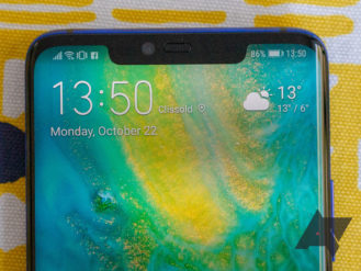
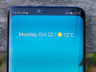
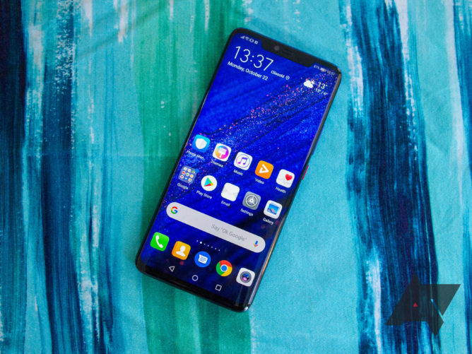
With a 6.39-inch, 19.5:9 display, the Mate 20 Pro is a substantial phone, in the same region as the last two Pixel XLs or the Samsung Galaxy S9+. The non-pro Mate 20 and the enormous X variant both feature minimal waterdrop notches, and look mightily handsome for it. Unfortunately, due to the inclusion of face unlock-enabling 3D depth sensors, the Mate 20 Pro’s notch is far wider and more obnoxious. I’m not generally opposed to notches if the trade-off is warranted, but I’m not sure that’s the case — more on that later.
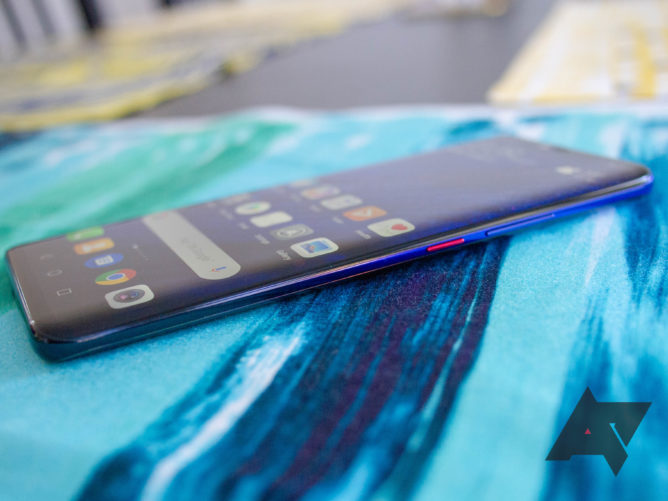
The OLED panel is of the highest quality. It’s bright, vivid, and can be favorably compared to the market-leading display in the Galaxy Note9. Like many of Samsung’s recent flagships, the sides of the screen are curved on the Mate 20 Pro. This is not something I’m a huge fan of since you notice a color difference on the side (particularly on white screens), but it feels great when swiping past the edges.
The aluminum frame and glass back together lend a reassuring weight to the phone without it feeling too heavy, and considering three cameras and a 4,200mAh battery have been crammed in, it’s still a pretty thin device. Even the camera module exhibits only a very minimal bump. The construction is impressive all in all, and an IP68 rating puts it on a par with competitors in terms of water and dust resistance.
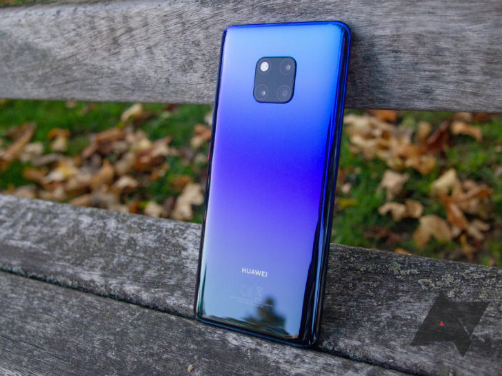
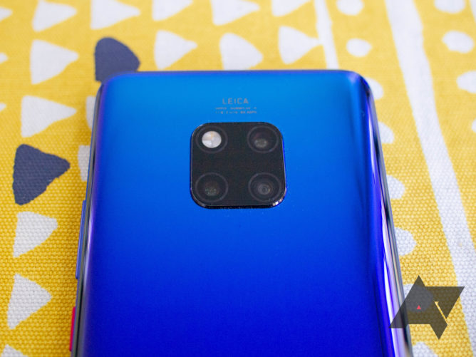
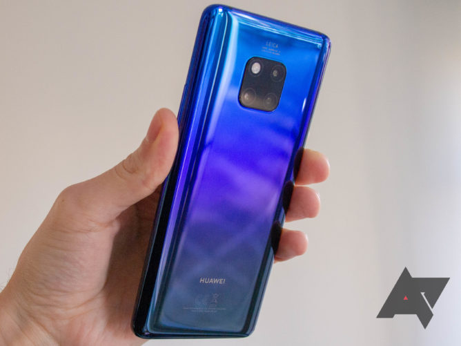
When the P20 Pro was released, everyone raved about the bold colors, especially the Twilight (blue-ish/purple-ish gradient) option. As you can hopefully see (this thing was a nightmare to photograph), my review module features a similar visual effect, also called Twilight. I’m sure I’m in the minority here, but I actually think it looks too shiny and rather cheap compared to the P20 Pro equivalent. The three-tone gradient doesn’t work as well, with a very dark blue towards the bottom, and fingerprints are a constant annoyance. By contrast, the beautiful Emerald Green and Midnight Blue variants come with a ‘Hyper Optical Pattern’ — stripes, between me and you — that gives them a more matte look and conceals fingerprints better.
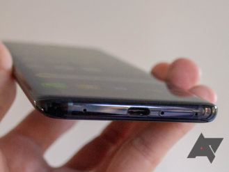
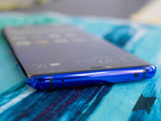
While we’re on the outside, there’s sadly no 3.5mm headphone jack, but you will find a gaudy red power button, volume rocker, USB Type-C port, an array of mics, and an IR blaster. The earpiece is complemented by a speaker in the USB port for stereo audio — something I’ve never seen before — which somehow doesn’t get muffled when a charger is plugged in, and although the bottom one is much louder than the other, the sound is perfectly acceptable. The haptics on the Mate 20 Pro are probably the best I’ve ever used, subtle and useful — for the first time in a long time, I didn’t switch them off when using the keyboard.
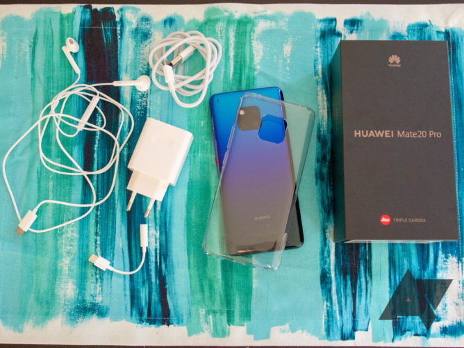
Alongside the phone, the box contains a 40W SuperCharge power brick, USB-A to C cable, USB-C earphones, a USB-C to 3.5mm headphone jack adapter, and (depending on the region) a TPU case. Although cheap and cheerful, the earphones don’t sound too bad, and the inline remote can be used with the Google Assistant.
Just as with the P20 Pro, the triple rear cameras with Leica optics are the main attraction here, and they don’t disappoint. The main 40MP RGB lens is unchanged, but the monochrome sensor is swapped out for a more useful 20MP ultra wide angle sensor, and the 8MP telephoto lens gets a bump to 5x optical zoom. AI software features are once again a key focus, with enhanced scene selection and a dedicated Night Mode for better low-light shots. A Google Lens-esque feature called HiVision is also on board.
The cameras sound good on paper, but they also perform well. Huawei’s processing has improved greatly in recent years, with excellent amounts of detail being preserved except in the darkest of areas. I found low-light shots were generally free of noise and didn’t need the Night Mode to come out well, and the colors were actually more accurate when I didn’t use it. Dynamic range isn’t the strongest, and unlike Google’s Pixel cameras, there’s no automatic HDR. There is a mode for it, though, if you can remember to use it.
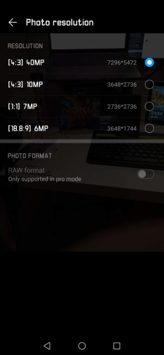
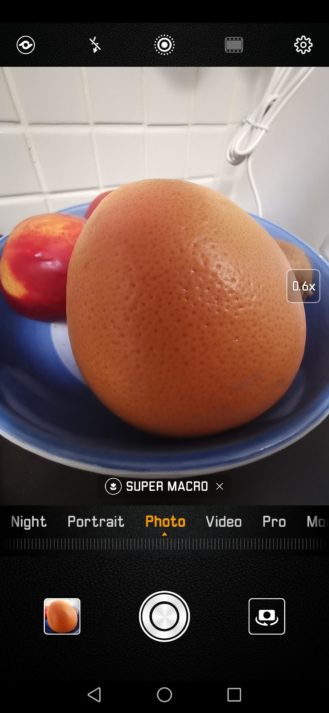
If there’s one real negative about the imaging experience, it’s the camera app itself. It’s unattractive for starters (like much of EMUI), but it’s also a little confusing when switching between the three cameras. By default, the resolution is set to 10MP, and in this mode, you’re able to seamlessly zoom from 0.6x (ultra wide angle) to 5x optical zoom and then on to 10x with digital zoom. If you want to make use of the full 40MP main sensor, you have to go into the settings and change to it, at which point zoom features are no longer available. I feel there should be a toggle in the main UI to make switching much easier than it is, but I suppose it’s something you’ll get used to.
I didn’t use the front-facing camera all that much, as I’m not really a selfie guy, but I’ve no complaints about the 24MP lens. The 3D depth sensors also allow for some janky Animoji ripoffs, but they are not done especially well, so I wouldn’t waste your time. I tried to take a range of sample shots using all the cameras, so you’ll see some ultra wide landscapes and super macro shots mixed in with some more standard examples below.
Probably, but there are some shortcomings. To my enduring frustration, Huawei seems to have done everything possible to make the notch stand out. The time stays on the right side of the status bar, but other status icons have to spill over to the left. If you like to show your battery percentage next to the icon, those and the clock are all that can fit on the right, and with the network signal, WiFi, Bluetooth, and sound mode icons showing up on the left, this leaves room for just one notification icon. Remove the battery percentage, or put it inside the icon, and instead of gaining another space for notifications while everything else moves up, an infernal NFC icon is added (a real pet hate of mine). This would all be fine if you could edit which icons are displayed, but you can’t — a baffling decision from Huawei given the paucity of space up there. What you can do is show a number for notifications instead of the single icon — better, but it’s still infuriating.
Notch on; notch off.
You can turn off the notch, in that you can make the status bar background black to essentially hide the cut-out. This doesn’t solve the problem of there not being enough room for icons, though. There are plenty of other poor decisions in EMUI 9.0, just as there have been in previous versions. Notification text looks cramped compared to stock Android, the settings are muddled with somethings living in hard to find places, and while these and other annoyances aren’t deal breakers by themselves, the overall experience leaves a lot to be desired.
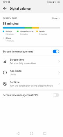
Despite all that, there are some useful things that other OEMs don’t do — I quite liked that only brand-new notifications appear on the lockscreen, and the toast message that lets you know when your connection changes from WiFi to mobile data is a nice touch. There’s also a Digital Balance feature, akin to Google’s still beta Digital Wellbeing, that can be used to track and limit phone usage for you or a child if you’re a parent.
As with most phones these days, there’s a gesture navigation option you can enable, but it involves a swiping from the edges to go back which is tricky to pull off consistently. The overview screen, no matter which nav you go for, is a pretty clear iPhone rip off.
There are plenty of poor decisions in EMUI 9.0, just as there have been in previous versions.
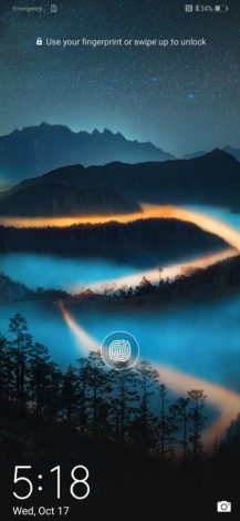
As I said before, a notch is a trade-off I could get on board with, if only face unlock method worked flawlessly. Unfortunately, it doesn’t. Even after refreshing my face data several times, it still only recognizes me around 80-90% of the time. Thankfully, the Mate 20 Pro also has a fingerprint sensor, except it’s under the display. We’ve seen this on a few concept phones and handsets only released in China, but this is the technology’s debut in a truly mainstream consumer device. While the Dynamic Pressure Sensing module works better than other in-display solutions I’ve tried, the hit rate isn’t much higher than face unlock, and the scanner is also far too high up on the display and a little tricky to locate without your full concentration. When it does work, it is at least very fast, so there’s hope for the future.
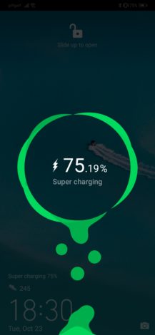
Left: The fingerprint sensor is too high. Right: Digital balance. Right: Lightning fast 40W charging.
At least the Mate 20 Pro can boast great performance in all other areas. The Kirin 980 chip is incredibly fast, and it now has a dual NPU (neural processing unit) dedicated to AI functions. With 6GB of RAM, memory management is also a breeze for the Mate 20 Pro. The phone handled everything I threw at it without breaking a sweat, which is a testament to Huawei’s hardware and software optimization.
Another major plus is the incredible battery life I got from this thing. It amazes me that they managed to squeeze a 4,200mAh battery into a phone so slim, and the resulting longevity is pretty spectacular. Even in review mode, I found myself ending the day with as much as 30% charge, so I wouldn’t be surprised to hear of someone getting two days of battery life out of the Mate 20 Pro. This will obviously depend on how you use the phone, though. When you do need to charge it, the included 40W charger is the fastest there is, which Huawei demonstrates by showing two decimal places when you plug it in so you can watch the percentage go up. It also supports Qi wireless charging at 15W if you’re into that. There’s also a crazy reverse charge feature that lets you top up other devices, though I wasn’t able to test that out myself.
As I try to work out how I feel about the Mate 20 Pro, I find myself somewhat conflicted. It’s an extraordinary piece of hardware, right up there with Samsung and Apple in terms of design and engineering. The cameras are also among the best you’ll find on a smartphone. Yet some of the decisions do need questioning. Neither biometric authentication method is consistent enough, leaving me longing for a rear-mounted fingerprint scanner and bemoaning the inclusion of such a sizable notch.
While I do admire Huawei’s courage in pushing boundaries with fledgling technologies, I do wish they’d concentrated on perfecting just one. It’s hard to justify the additional cost passed on to the consumer for those extravagant hardware choices. The regular Mate 20 addresses those gripes and costs as much as 250 Euros less (for the 4GB RAM model), but there are numerous other compromises there too. Ultimately, I find myself wishing Huawei had made a device somewhere in between the two, but you don’t always get what you wish for.
Buy it if…
You want a high-performance flagship phone with bleeding-edge technology, and you want to take amazing photos.
Don’t buy it if…
You’re not a fan of EMUI (I’m not sure anyone is?), you prefer a more reliable unlock method, you dislike notches, or you live in the US.
The Mate 20 Pro will sadly not be coming to the US in any official capacity, but those of you in other regions can pick one up from the following places:
UK – £899 – Amazon, Carphone Warehouse, Mobiles.co.uk
Germany – €999 – Amazon.de
France – €999 – Amazon.fr
Spain – €1,049 – Fnac.es


