Since Samsung unveiled the Infinity-O display, anticipation has been building for notchless phones with what’s become known as the hole-punch camera cutout. The View20, from Huawei sub-brand Honor, was unveiled in Paris today for the European market after debuting in Hong Kong at the end of 2018. From a purely aesthetic point of view, it’s certainly refreshing. The 4.5mm camera hole might not be quite as inconspicuous as Honor’s marketing materials would have us believe, but it’s got to be better than a notch, right?
The other major selling point of the View20 is that it’s the first phone to ship with a 48MP camera sensor — the Sony IMX586 CMOS — with tiny 0.8 μm pixels. We know Huawei has the processing prowess to make the most of it, and the powerful Kirin 980 chip from the Mate 20 Pro is on board to help out. On paper, the View20 has a lot going for it, and it mostly doesn’t disappoint.
The model I’m testing has 6GB of RAM and 128GB of storage, although there will also be a Moschino co-branded 8/256GB variant. It’s worth noting that this is a pre-production unit with a little less polish than you might expect from a final retail product.
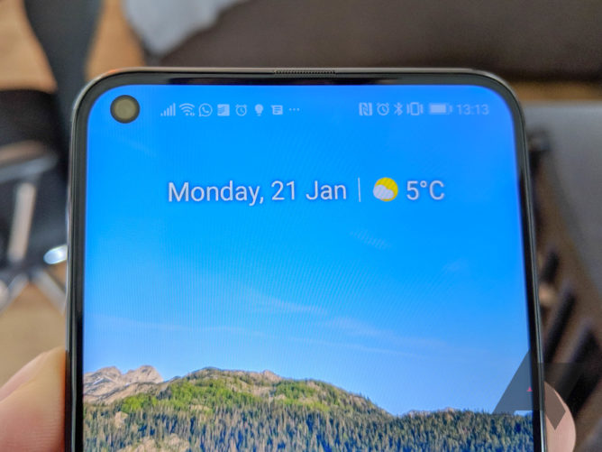
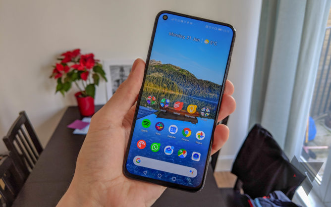
So the screen has a hole in it, and in that hole is a camera. It’s a trend that’s likely to permeate throughout the industry over the next 12 months and my initial reaction is a positive one. To my eyes, a hole-punch cutout is more attractive than a notch. It doesn’t break the line of the bezel that goes all the way around the screen, and even though the pixels between hole and edge are useless, they wouldn’t be used for all that much anyway. It’s been pointed out that the hole doesn’t sit nicely in the round of the screen’s corner, and while this is an unattractive design quirk, it’s easily forgotten.
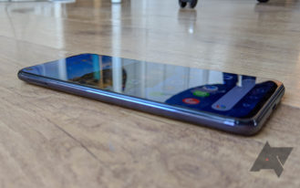
At first glance, the 6.4-inch display appears to be pretty decent for an LCD panel, but upon closer inspection, you realize why OLED is the preferred technology in higher-end phones. Visible particularly on a white screen in a dimly-lit room, there is some considerable unevenness to the backlighting around the edges. It’s difficult to photograph (see above), but the curved corners of the display allow a fair amount of light to bleed out. I didn’t notice this for several days, proving that it is something you could live with, but you certainly wouldn’t accept it on a more expensive handset. It’s possible that this is limited to this phone or a batch of pre-production units, but it’s cause for concern.
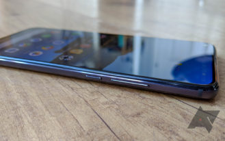
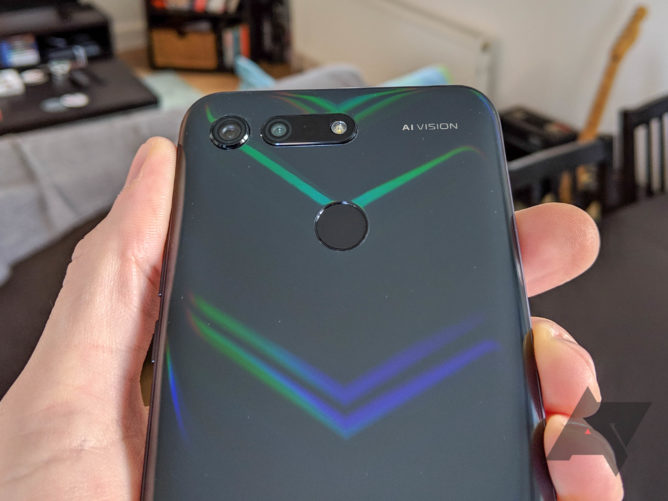
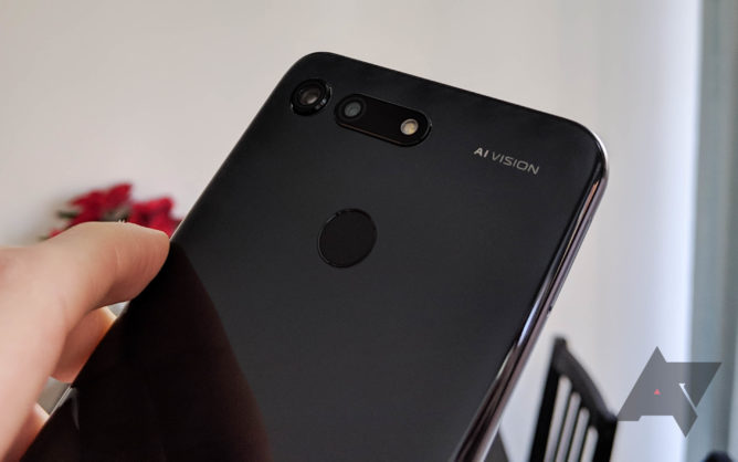
Screen aside, build quality is generally very high. The glass curves subtly, both front and back, where it meets the aluminum frame. A fingerprint scanner is in my preferred location on the upper rear, and only the slightest bumps accompany the camera housings. Conforming to the recent trend of more interesting phone designs, the View20 has a nano-textured back that shows a shimmering V pattern in the right light. On blue and red variants, this can look a little garish, but it’s subtle and classy on my Midnight Black model.
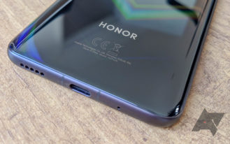
To ensure a minimal top bezel, a thin earpiece is incorporated into it and the proximity sensor is on the top next to an IR blaster. Although I mostly use Bluetooth headphones at this point, it’s pleasing to see that a 3.5mm headphone jack is also included. One hardware feature that quickly disappointed was the vibration motor. It’s loud and rattly and typing haptics were so unsatisfying I turned them off. Just as with OnePlus phones, there’s no Ingress Protection rating for Honor’s latest flagship, nor is there any mention of waterproofing whatsoever.
In the box, the View20 is accompanied by a 4.5V/5A charger and USB-A to C cable, plus a slender, transparent TPU case that offers adequate protection while allowing the rear design to shine through.
With the P20 and Mate 20 series, Huawei has offered the fiercest competition to Google’s Pixel phones and Apple’s iPhones in the imaging department. For the Honor View 20, we get Sony’s brand-new 48MP sensor combined with a 3D TOF module for improved depth of field applications. The hardware may be different, but the results are much the same: incredible detail, great color reproduction, and decent contrast. The AI camera mode uses object recognition to enhance contrast and color in certain parts of an image, which makes for beautiful shots but with diminished accuracy.
48MP Ultra Clarity, which would be even more impressive in better light (blame British weather).
Super Night Shot uses pixel binning and AIS for a night mode similar to that popularized by Google — I still can’t quite believe how much light it’s able to find for these shots. The 48MP AI Ultra Clarity mode works in a similar way, by combining several frames taken over the course of a few seconds, but in this case for a super sharp high-resolution image instead. It’s advisable to use the default 12MP setting for regular low-light images, rather than the full 48 megapixels. There are a bunch of other features with the AI prefix, including automatic smile capturing, 4D predictive focus for moving subjects, and object identification (like Google Lens) for shopping.
Super Night Shot comparison.
For those who like to tinker more with their photography, there’s a pro camera mode with support for RAW files, variable aperture mode, and a separate HDR mode. A 25MP camera resides in the display hole to adequately serve all your portrait selfie needs, with an AR Lens feature aimed at mimicking Apple’s Animoji, albeit in a creepier fashion. 960fps slow-motion video is a popular addition to new high-end phones these days, and the View20 gets it too.
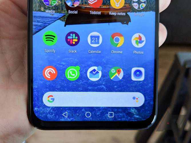
Unlike phones with huge notches (looking at you, Pixel 3 XL) the status bar is an inoffensive height on the View20, with the camera hole taking up the space of roughly an icon and a half in width. It’s rarely bothersome except when the status bar is a vastly different color to the top portion of an app — the hole is right on the edge of the dividing line and this is jarring. Watch a video or play a game in full-screen and the cutout poses further problems, but that’s an inevitable downside to this type of cutout, so if you can’t deal with that it’s not the phone for you.
Some UI decisions associated with the hole simply don’t make sense. It’s good to see the clock to the right of the status bar but I cannot make sense of putting the WiFi and signal icons on the left next to the camera. Even without Honor doing away with the ridiculous NFC icon (who would ever turn it off anyway?), there’s plenty of room for status icons without meddling with space that should be reserved for notifications.
That’s not the only problem in this important area, either. Arguably the biggest flaw of EMUI/Magic UI is that only brand-new notifications appear on the lock screen while all previous ones are hidden. I’m sure many people have gotten used to this, but it’s maddening not to be able to decide this behavior for yourself. Expanding lock screen notifications takes one tap more than it needs to and they can’t be swiped, and this includes controls for apps currently playing audio that are thankfully easier to access on other phones.
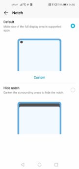
You can still turn the hole-punch off like you could with a notch.
There are a few other software gripes to speak of, including a bug where the navigation buttons inexplicably move slightly to the left of their normal positions for a while. Honor and Huawei phones also tend to scroll slowly compared to other phones, which can be tedious. Magic UI doesn’t play nicely with wallpaper apps other than its own, meaning Google Wallpapers can’t set the lock screen background and the home screen one doesn’t look right. I’m still not a huge fan of the software design in general, but I’ll admit it is improving. Like any Chinese OEM, Huawei/Honor needs to make further concessions for Western users if it’s to poach even more customers from the likes of Samsung, Google, OnePlus, et al.
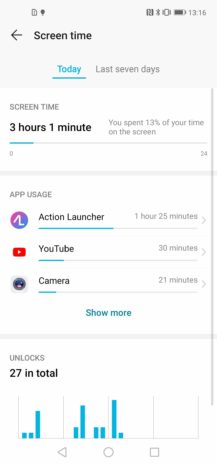
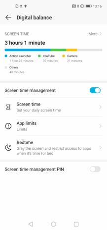
It would be remiss of me not to point out some things I actually like about Magic UI. The sharing menu is undoubtedly better than the hot mess that is Android’s native solution, although maybe that’s not saying much. Link Turbo is an impressive feature, switching between WiFi and data — sometimes using both at once — to give you the best connection at all times. This is very useful in the corner of my bedroom where I charge my phone at night — the one WiFi dead zone in my house. It’s obviously even handier when out and about. Since digital wellbeing is so in vogue, this phone has its own ‘Digital balance’ section in the settings showing you the total time spent using it, the number of unlocks, and app usage. If you wish to curtail your burgeoning smartphone addiction (or that of your children), you can utilize the ‘Screen time management’ option to set limits and institute a curfew.
Looking past the software, the Honor View20 is an excellent performer. The same 7nm octa-core Kirin 980 with dual NPU used in the Huawei Mate 20 Pro works its AI magic here once again, coupled with 6GB of RAM and 128GB of storage. Animations are smooth, multitasking is swift, and you’ll be hard-pushed to find any app or game that will slow it in its tracks. Additional cutting-edge tech has also made its way into the phone, such as Triple Antenna WiFi and Dual Frequency GPS.
While the View20 is far from a dedicated gaming phone, it does have a few tricks up its sleeve that could convince you otherwise. GPU Turbo 2.0 and NINE liquid cooling technology are included to entice serious gamers, and the 3D camera can also be used for motion-controlled gaming experiences à la Microsoft’s Kinect (although not without a special dock).
With that amount going on inside the device, you’d be forgiven for thinking battery life would take a hit. On the contrary, the 4,000mAh cell lasts longer than anything I’ve used in a long time. I checked each night before bed and not once had it dropped below 50%, usually with around four hours of screen-on-time. I’ve been used to the Pixel 3 XL hitting 15% a bit before bed with similar usage, so the View20 is mightily impressive here. To begin with, at least, many people will be able to get two days from it. Since it lasts so long, you might forget to charge it — not to worry, fast-charging can get you 55% in 15 minutes. Reverse charge is also nice to have.
Maybe. At launch, the Honor View10 cost £449 and that represented decent value for what was a very capable budget-flagship phone. The View20 is a worthy successor, offering camera quality similar to the Mate 20 Pro while doing away with some of the more expensive and arguably less important features. Sure, there’s no secure face unlock or in-screen fingerprint scanner, but they are still not as fast and accurate as the good old-fashioned rear FS-sensor on the View20. Sure, there’s no wireless charging or wide-angle lens, but those are luxuries most people can do without.
What you do get is the same chip as the Mate 20 Pro, ridiculously good battery life with fast-charging, a 48MP camera that takes great photos, and a headphone jack. For a price of £499 / €569, it’s not a bad package. On sale, it would make even more sense.
So it’s a tale of compromise, like many other phones in the budget-flagship space. Competitors like the OnePlus 6T and Xiaomi Mi 8 Pro might have features that matter more to you and, ultimately, it’s going to come down to what you want/need from your phone. The Honor View20, despite a less than perfect display, is good enough to contend for your hard-earned cash in the same category, especially if photography is top of your checklist.
Buy if:
- You want a super high-res camera and great performance with a more agreeable screen cutout and an affordable price tag.
Don’t buy if:
- You won’t settle for a less-than-perfect display or you are used to a friendlier software experience.


